MOPO Design System
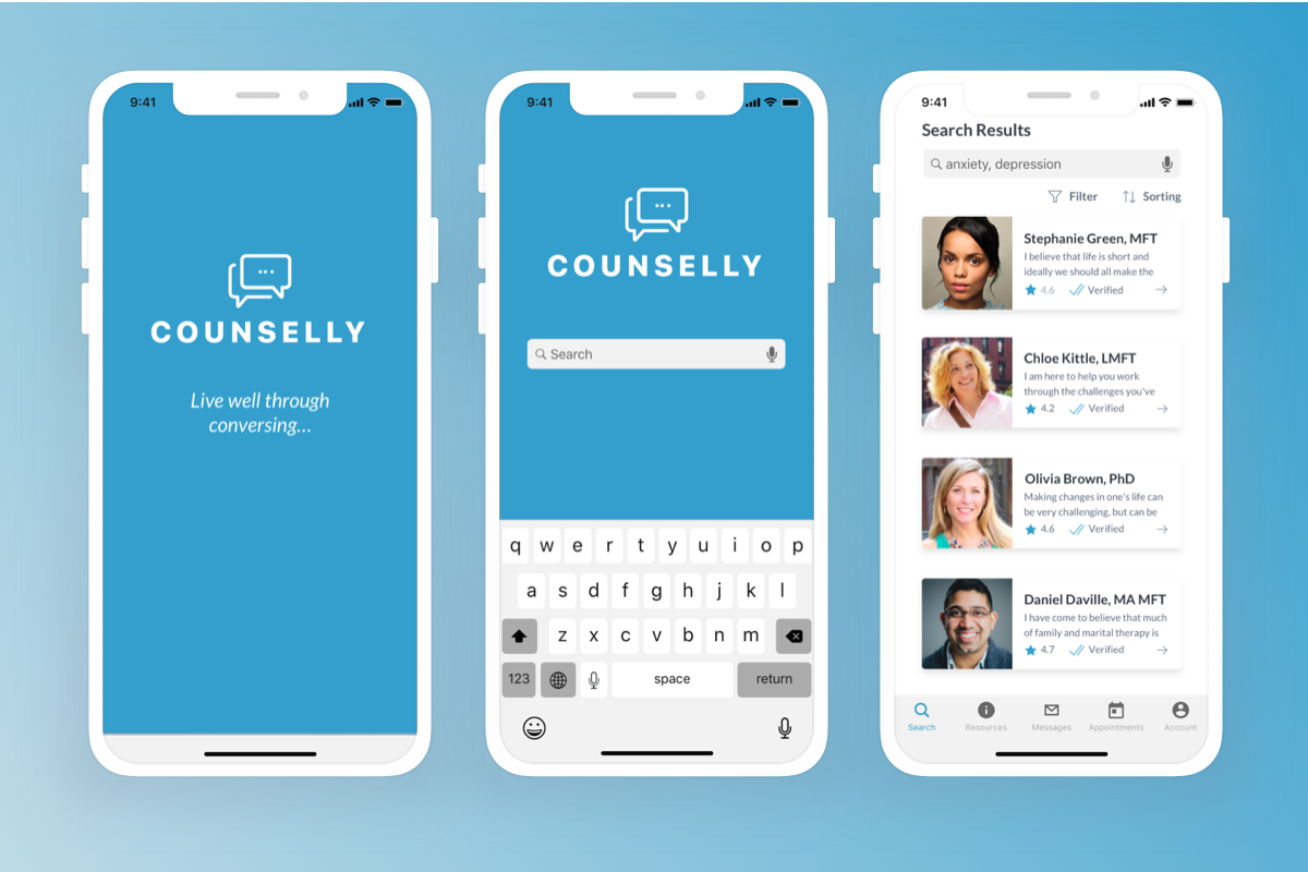
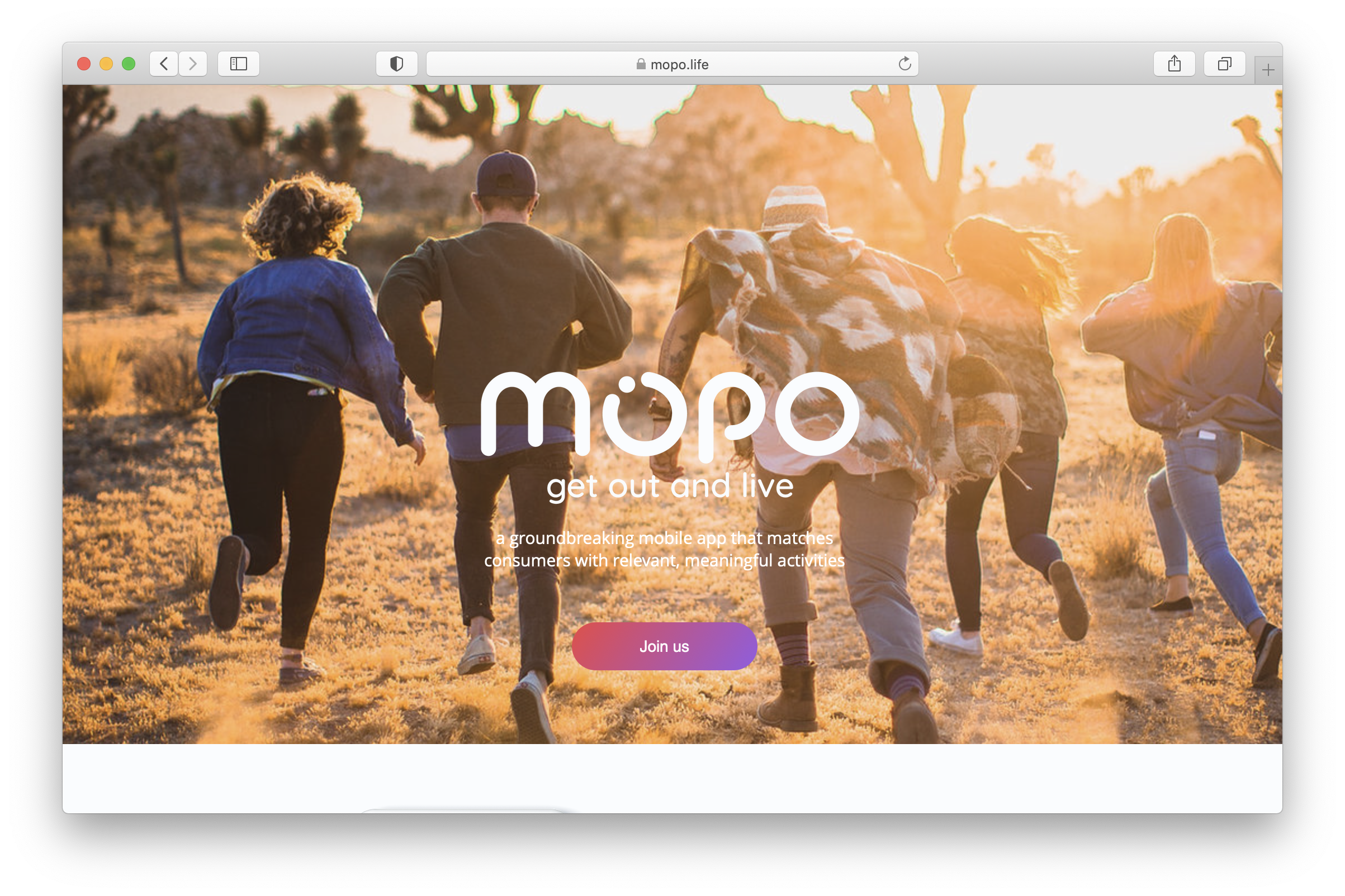
MOPO is a startup project with a social discovery features across web and native platforms.
It's a community where you can discover the coolest things to do based on where you live, where you are, or where you're headed.

Discover the coolest things to do!
Overview
• Team of 3 UX designers
• Collaborating with CEO, VP Engineering, Head of Product
• Fast paced, short deadlines
• Design process became a mess
Designer 1 started in Adobe XD and setup intial product mockups without any system. Then I came in to collaborate with Designer 2 and we needed to get organized. So moved it all to Figma.
Design Team
Rachel, Kat and Manus. We worked at different phases on the product.
Problem
As we were exploring and building out new features, it was chaotic, inefficient and inconsistent. Time was wasted. That resulted in collaboration blockers.
Process
Identify all inconsistencies and streamline a simplified design system. Develop foundational elements including spacing, grids, typography scales, colors systems, etc. Lastly, implement a design token structure.
Before the System
We had a general style guide that showcased the different types of colors and typography. We did not have different alert colors and varying primary and secondary colors.


Colors
Developed categories of common groupings of colors. Also confirmed if they were WCAG compliant.


Typography
Developed categories of common groupings of colors.


Buttons & Spacing
Developed 3 sizes of buttons. The button breakdown shows the anatomy of the button.
Spacing tokens will help when documenting components like buttons, alerts, text fields, cards, etc.


Old Cards
Previously the cards that were created lacked structure and most of the time they were copied and pasted when creating new ones. If there were any slight changes, imagine adjusting all the cards.

Old cards lacked consistancy and the file structure was not easily readable. Alignment was off.

New Cards
I created a new card using components and utilizing properties and booleans in Figma.


The folder structure is easier to understand. I created booleans and properties for each item. There is consistent padding and spacing between items.

Components
It'll be efficient to grab a component that has different states, properties and booleans. The user has all the options available.

Results
With all the effort, a small design system was created. The team is setup to collaborate efficiently. The product will be more cohesive for the end customers, brand will be stronger.
A valuable thing a design system can do is increase the velocity of the team. Second, it supports consistency across the product.
Selected Works