Survey Monkey - Marketing Design System
Overview
MDS was a six-month effort to build SurveyMonkey marketing's first shared design system — before this, marketing design, PM, and engineering had no common component vocabulary, and every new page meant re-deriving implementation details from scratch. As the UX Designer leading the effort, I owned the system from component architecture through documentation and team onboarding, working alongside marketing's design, PM, and engineering functions to get it adopted.
The system was scoped to marketing specifically, not the broader product org — that scope let me move fast and get to full adoption within it, rather than stalling on a company-wide initiative with no mandate behind it.
Problem
Before MDS, SurveyMonkey's marketing org had no shared component library — design, PM, and engineering were each working from their own assumptions about what a "button" or "card" was supposed to be. That gap showed up constantly at handoff: engineers had to interpret Figma files component-by-component instead of referencing a known standard, which meant every new page carried the same negotiation over again.
There was no documentation and no single source of truth, so inconsistency wasn't an edge case — it was the default. The system needed to exist before marketing could build pages faster than one-off.
Project Goals and Success Criteria
The goal was a complete component library in Figma, structured to match engineering's existing token system, with documentation in ZeroHeight that both designers and engineers would actually reference — not a design-only artifact that eng ignored.
I didn't have formal success metrics in place from day one — this was a first-of-its-kind system for the org, built while defining what "done" looked like. In practice, success meant full adoption across marketing design, PM, and engineering, and a measurable drop in the back-and-forth eng needed to verify design intent (fonts, spacing, sizing) before shipping
Research and Discovery
I started with conversations across marketing design, PM, and engineering to understand where the friction actually lived. The clearest signal: engineers were repeatedly re-verifying design details — fonts, spacing, component states — because there was no shared reference they could trust. That wasn't a documentation problem so much as a structural one: Figma had no equivalent to engineering's token system, so even well-documented styles didn't close the gap.
That finding shaped the whole approach — instead of building an idealized component library first and writing documentation after, I prioritized structural alignment with engineering's existing systems (tokens) from the start, treating documentation as secondary to getting the underlying structure right.
Design Process
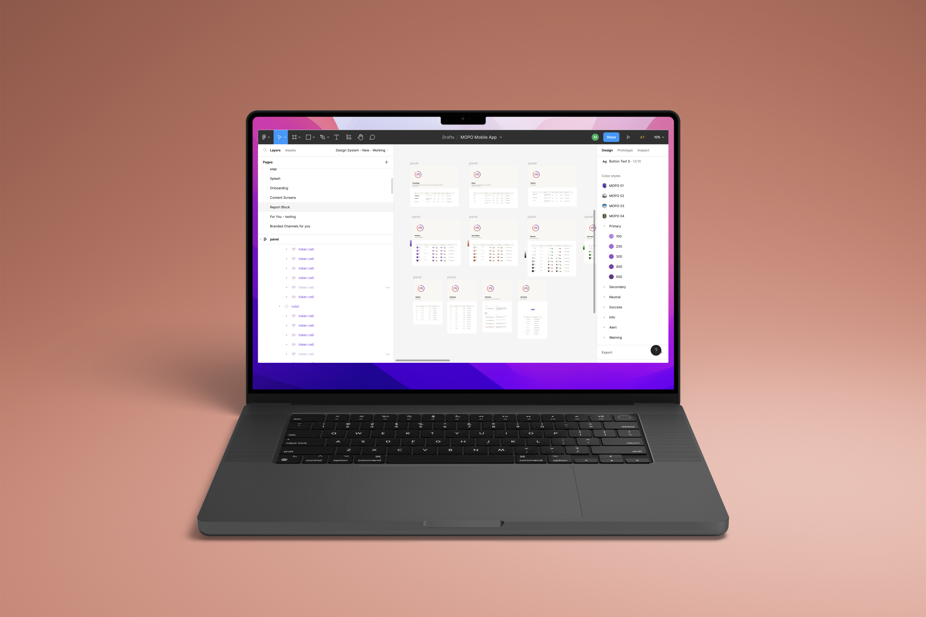
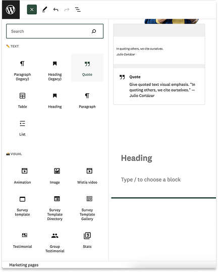
The design process began with constructing a 1:1 component library in Figma that directly mirrored the behavior and constraints of our CMS. I focused on creating atomic, reusable components with the accuracy and fidelity needed to translate cleanly into code, working closely with engineering to keep design logic aligned with technical feasibility from day one.
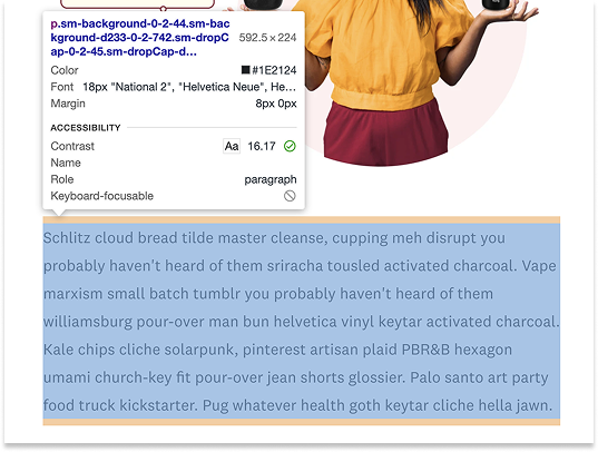
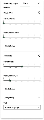
One specific gap I closed: engineering already had a token system for typography (size-1, size-2, etc.), but Figma's native styles had no structural relationship to those tokens — a designer could apply a style, and engineering still had to manually determine which token it mapped to on every handoff. I audited engineering's existing token structure and rebuilt the Figma library to match it directly, rather than introducing a separate design-side naming convention. That eliminated the manual verification step from every page build.
The process wasn't without challenges — many components had ambiguous names or lacked standardized descriptors, and the volume of variations required thoughtful structuring to stay scalable. I used Figma's boolean and variable features to build flexibility into the system without sacrificing clarity or maintainability.

Final Solution
I built MDS as a 1:1 mirror of our CMS rather than an idealized component set — every component's constraints matched what marketing engineering could actually ship, not what looked cleanest in Figma. That decision meant sacrificing some visual flexibility upfront, but it eliminated the handoff renegotiation that ad hoc components had been causing between marketing design and marketing eng.
MDS had no top-down mandate — adoption inside the marketing org had to be earned, not assumed. I ran that rollout myself: live training sessions, recorded walkthroughs, and internal presentations aimed at the PMs and engineers who'd be using it day-to-day, not just the design team. By the time I left, the entire marketing design, PM, and engineering group had adopted MDS as the shared source of truth for marketing surfaces.
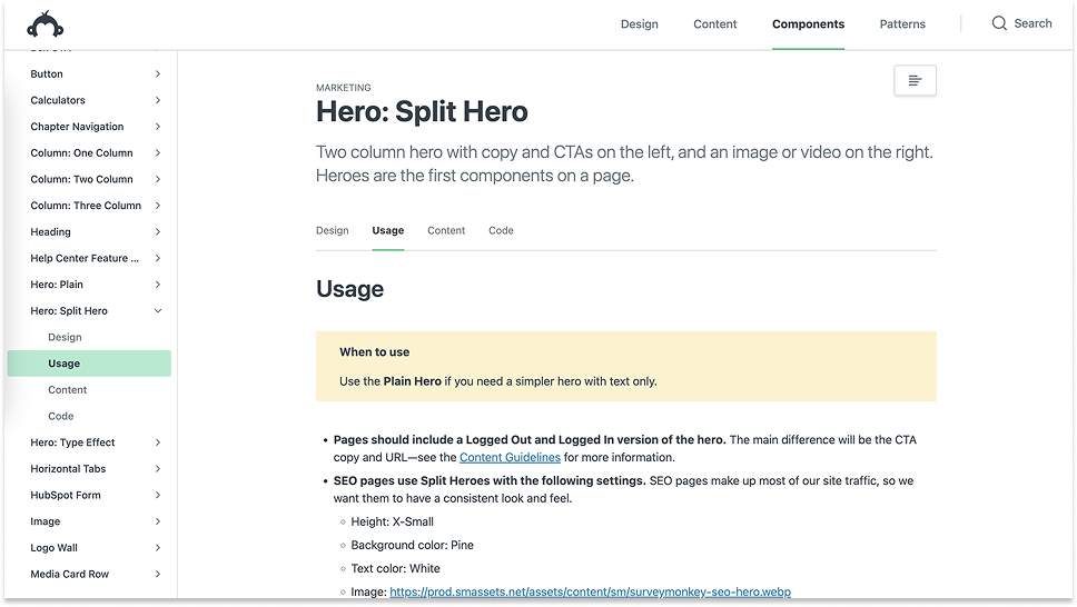
Documentation in ZeroHeight doubled as the pitch, not just the spec — every component page led with why the pattern existed, because the audience included PMs and engineers deciding whether the system was worth conforming to, not just designers looking up implementation details.
Validation and Feedback
I ran the system by the designers, PMs, and engineers who'd actually be using it day-to-day rather than treating rollout as a one-time announcement. Early feedback surfaced real friction — some component names were ambiguous, and a few designers weren't sure when to use a new component versus an existing pattern.
I used that feedback to tighten naming conventions and clarify documentation before pushing for full adoption, rather than shipping once and letting confusion sit. That iteration mattered more than the initial build — a system nobody trusts to be current doesn't get used regardless of how well it was architected.
Impact and Results
Before MDS, marketing design, PM, and engineering were operating without a shared component vocabulary — every new page meant renegotiating implementation details between design and eng from scratch, because there was nothing to point to as the standard. After rollout, that renegotiation largely disappeared for marketing surfaces. One concrete example: typography and spacing were tokenized instead of manually specified, so engineers no longer had to cross-check fonts, sizes, and spacing values against a Figma file by eye — they referenced the token and trusted it was correct. That kind of small, repeated friction is exactly what was costing time on every page build, and it's what MDS eliminated first.
The clearest signal of impact wasn't a metric I tracked at the time — it was that the group I'd have had to convince to use MDS became the group asking for new components to be added to it. That's the difference between a system people tolerate and one they treat as infrastructure.
The limitation is real and worth stating plainly: this was scoped to marketing, not the broader product org, and I didn't instrument adoption with hard numbers while I was there. What I can defend is the qualitative shift — from ad hoc, one-off component builds to a single system marketing treated as the default.

“He worked on maintaining our complicated design system working directly with myself on Product and our Engineering team to understand the technical challenges & come up with great solutions!”
Angela Accomazzo, Product, Gusto

“Within his first few months, he learned the intricacies of our neglected design system, taking the time to really understand the user experience for customers and internal employees. His strong systems thinking helped us stay focused and consistent as we grew our design system...”
Christine Pasetes, Product Manager, Content Platform, Survey Monkey
Reflection
The biggest lesson wasn't about process — it was that a design system with no mandate has to prove its value before anyone will use it. I couldn't assume adoption; I had to earn it, first by making the system technically trustworthy (matching engineering's existing token structure instead of inventing a parallel one) and then by rolling it out directly to the people who'd actually use it day-to-day, not just presenting it to design.
If I approached it again, I'd build the case for governance before handing the system off — MDS worked because I was still hands-on with every addition, and that doesn't scale past one person. I'd want a lightweight contribution process defined before I left the project, not after.
Selected Works